Difference between revisions of "Ivan-big-data"
| (13 intermediate revisions by the same user not shown) | |||
| Line 79: | Line 79: | ||
==Develop and document the model function you are exploring in the data== | ==Develop and document the model function you are exploring in the data== | ||
==Develop a visualization to show the model/patterns in the data== | ==Develop a visualization to show the model/patterns in the data== | ||
| + | |||
| + | |||
| + | =====<div class="center" style="width:auto; margin-left:auto; margin-right:auto;"><span style="font-size:250%; color:#FF0000"> '''Results''' </span></div>===== | ||
| + | |||
| + | |||
| + | ==The story== | ||
| + | |||
| + | Main reason why I started with this data-sets was because I was trying to prove the relationship between abortion and crime rate. I was not able to, but I found many other interesting discoveries. | ||
| + | |||
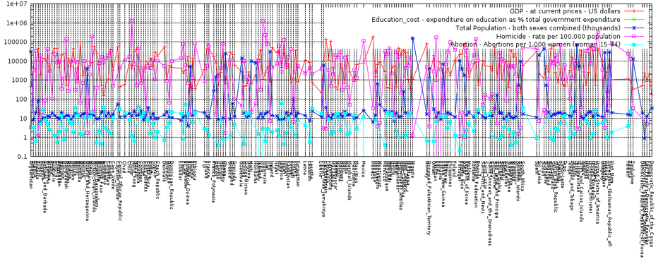
| + | -- Since I had data about Homicide, Education, Abortion, HIV Incidence, Population and GDP I was planing just to plot everything on one graph and than to look for relationship. That idea did not turned out well, as you will be able to see in the next chapter. <br/> | ||
| + | <br/> | ||
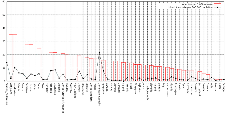
| + | -- That Abortion is related to Homicide. More abortion, more homicide.<br/> | ||
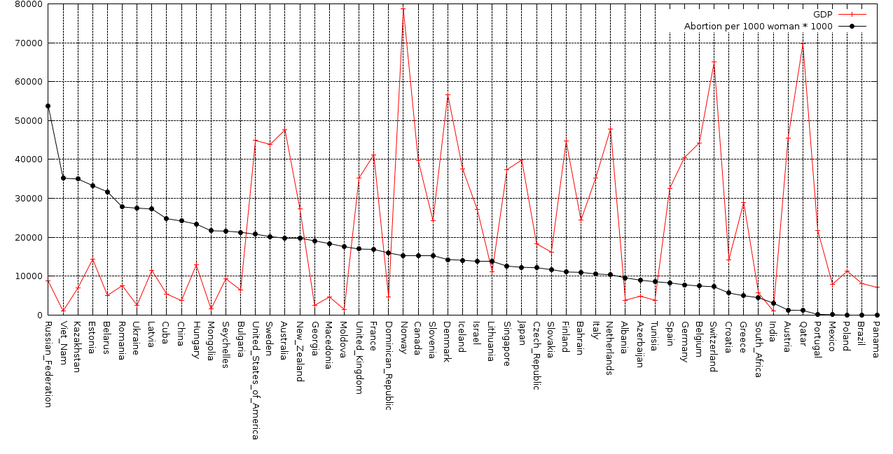
| + | -- That Abortion is related to GDP. More abortion if smaller GDP.<br/> | ||
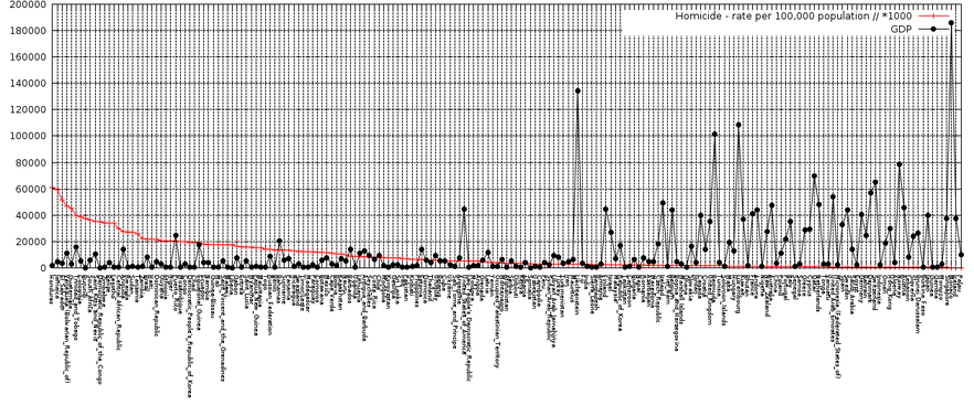
| + | -- That Homicide is related to GDP. More GDP less homicide. Which make sense because many homicide cases are related to lack of money. <br/> | ||
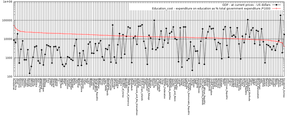
| + | -- Countries that are investing a lot in to education do not have that great GDP. Which kind of make sense because I used the latest data. I believe that countries with small GDP realized that one of the way to fix it is to invest in to education.<br/> | ||
| + | |||
| + | |||
| + | |||
| + | ==The visualization(s)== | ||
| + | |||
| + | * Trying to plot everything on one graph | ||
| + | [[Image:1_EVERITHING.png]] | ||
| + | |||
| + | |||
| + | * Abortion - Homicide relationship | ||
| + | [[Image:7_Abortion_Homicide.png]] | ||
| + | |||
| + | |||
| + | * Abortion - GDP relationship | ||
| + | [[Image:8_GDP_abortion_3.png]] | ||
| + | |||
| + | |||
| + | * Homicide - GDP relationship | ||
| + | [[Image:10_GDP_homicide_2.png]] | ||
| + | |||
| + | |||
| + | * Education - GDP relationship | ||
| + | [[Image:11_Education_gdp.png]] | ||
| + | |||
| + | |||
| + | * I used Gnuplot to visualize this data. Some of the commands are here: | ||
| + | |||
| + | >> set grid <br/> | ||
| + | >> set xtics rotate by -90 font ",2"<br/> | ||
| + | >> plot "./data.txt" using 2:xticlabels(1) t "Expenditure on education (% of gov budget)" with boxes, "./data.txt" using 3:xticlabels(1) t "Abortions per 1,000 women (woman 15-44)" with lp 7<br/> | ||
===== Tech Details ===== | ===== Tech Details ===== | ||
* Node: as2 | * Node: as2 | ||
* Path to storage space: /scratch/big-data/ivan | * Path to storage space: /scratch/big-data/ivan | ||
| − | |||
| − | |||
| − | |||
| − | |||
Latest revision as of 21:00, 4 December 2011
Contents
- 1 Project Tasks
- 2 Identifying and downloading the target data set
- 3 Metadata
- 4 Questions
- 5 Data cleaning and pre-processing
- 6 Load the data into your Postgres instance
- 7 Develop queries to explore your ideas in the data
- 8 Develop and document the model function you are exploring in the data
- 9 Develop a visualization to show the model/patterns in the data
- 10 The story
- 11 The visualization(s)
Project Tasks
- Project title: Relationship between Homicide, Education, Abortion, HIV Incidence, Population and GDP for countries around the globe
- Project data set: United Nations DB (UNdata)
Identifying and downloading the target data set
- Data sets can be founded here:
-- http://data.un.org/Data.aspx?q=gdp&d=SNAAMA&f=grID%3a101%3bcurrID%3aUSD%3bpcFlag%3a1
-- http://data.un.org/Data.aspx?d=UNAIDS&f=inID%3a32
-- http://data.un.org/Data.aspx?q=population&d=PopDiv&f=variableID%3a12
-- http://data.un.org/Data.aspx?q=abortion&d=GenderStat&f=inID%3a12
-- http://data.un.org/Data.aspx?q=education&d=UNESCO&f=series%3aXGOVEXP
-- http://data.un.org/Data.aspx?d=UNODC&f=tableCode%3a1
Metadata
- Homicide - rate per 100,000 population
-- Data for 195 countries
-- Min: 0.373944299393987
-- Max: 60.8707260176513
- Education_cost - expenditure on education as % total government expenditure
-- Data for 170 countries
-- Min: 10.13355
-- Max: 53.99897
- Abortion - Abortions per 1,000 women (woman 15-44)
-- Data for 61 countries
-- Min: 0.1
-- Max: 53.7
- Total Population - both sexes combined (thousands)
-- Data for 263 countries
-- Min: 0.146
-- Max: 6895889.018
- GDP - at current prices - US dollars
-- Data for 209 countries
-- Min: 150.617985349753
-- Max: 186174.902651821
Questions
- Discover is there any relationship between:
-- Everything (Not so good idea)
-- Abortion - Crime
-- Abortion - Homicide
-- GDP - Abortion
-- GDP - Homicide
-- Education - GDP
-- Education - Homicide
Data cleaning and pre-processing
The first obstacle I faced with cleaning and pre-processing was inconsistency in countries naming. For example name China in education and name People's Republic of China in homicide... So when I did full join of country columns I realized that not all of them are in one line (things that are supposed to be in one line). So I changed names and made it unique through all 6 data sets.
Load the data into your Postgres instance
Data-sets I downloaded were in CSV files.
- Here is an example for inserting data-set homicide into my PQSL:
drop table homicide;
create TABLE homicide (COUNTRY varchar primary key, YEAR int, RATE float);
COPY homicide FROM '/home/postgres/HOMICIDE.csv' DELIMITER ';' CSV;
Develop queries to explore your ideas in the data
- Query to connect all data sets with country as a unique key and to see the overlap (Use full join to see all):
select * from (((gdp inner join education_cost ON (gdp.country = education_cost.country))
inner join population ON (gdp.country = population.country))
inner join homicide ON (gdp.country = homicide.country))
inner join abortion ON (gdp.country = abortion.country)
- This is what I used to export result from PSQL to CSV:
Copy (some_query) to '/home/postgres/something.csv' with CSV;
Develop and document the model function you are exploring in the data
Develop a visualization to show the model/patterns in the data
Results
The story
Main reason why I started with this data-sets was because I was trying to prove the relationship between abortion and crime rate. I was not able to, but I found many other interesting discoveries.
-- Since I had data about Homicide, Education, Abortion, HIV Incidence, Population and GDP I was planing just to plot everything on one graph and than to look for relationship. That idea did not turned out well, as you will be able to see in the next chapter.
-- That Abortion is related to Homicide. More abortion, more homicide.
-- That Abortion is related to GDP. More abortion if smaller GDP.
-- That Homicide is related to GDP. More GDP less homicide. Which make sense because many homicide cases are related to lack of money.
-- Countries that are investing a lot in to education do not have that great GDP. Which kind of make sense because I used the latest data. I believe that countries with small GDP realized that one of the way to fix it is to invest in to education.
The visualization(s)
- Trying to plot everything on one graph
- Abortion - Homicide relationship
- Abortion - GDP relationship
- Homicide - GDP relationship
- Education - GDP relationship
- I used Gnuplot to visualize this data. Some of the commands are here:
>> set grid
>> set xtics rotate by -90 font ",2"
>> plot "./data.txt" using 2:xticlabels(1) t "Expenditure on education (% of gov budget)" with boxes, "./data.txt" using 3:xticlabels(1) t "Abortions per 1,000 women (woman 15-44)" with lp 7
Tech Details
- Node: as2
- Path to storage space: /scratch/big-data/ivan
