Difference between revisions of "Elena-big-data"
| (29 intermediate revisions by the same user not shown) | |||
| Line 1: | Line 1: | ||
| − | * | + | *Title: '''Stereotypes Through Statistics''' |
| − | * | + | *Dataset used: A Profile of Immigrant Population in the 21st century in OECD Countries |
| + | *Aims and Ideas: Having a dataset about immigrants' population, I had a chance to create different population profiles, with the aim to verify and/or disprove certain stereotypical knowledge about the immigrants, as well as different nations. This includes me looking at occupations, countries of birth and labour force status. | ||
| + | *Complications: Unfortunatly, my data didn't include any unique identifiers, which made it hard to work with the dataset, as well as made it not possible to answer some of wanted queries. Also, data didn't have range of years, which limited me in the ways of exploring the data. When viewing my results, please, keep in mind that the data was collected for the year 2000, and is limited only for OECD countries. | ||
===== Project Tasks ===== | ===== Project Tasks ===== | ||
| − | + | *Identifying and downloading the target data set | |
| − | + | The dataset can be downloaded from here: http://www.oecd.org/document/51/0,3746,en_2649_33931_40644339_1_1_1_1,00.html | |
| − | + | *Data cleaning and pre-processing: | |
| − | + | Data is in CSV format. I had to illuminate few charcters. I erased ^M by using dos2unix file1 > file2 command | |
| − | + | *Load the data into your Postgres instance: | |
| − | + | Example of creating a table: | |
| − | + | create table citizenship_age (country char(5),coub char(10),fborn int, edu_lfs int, edu_cen int, age_lfs int, age_cen int, nat int, number int, reg_oecd int, reg_regions char(30)); | |
| + | The used command for import is: | ||
| + | copy citizenship_age from '/path/to/the/file/FILE.csv DELIMITER ',' CSV; | ||
| + | *Develop queries to explore your ideas in the data | ||
| + | These are the examples of some of the queries I used to investigate different areas of my analysis | ||
| + | Viewing total immigrants' population in USA, sorted by the country of birth: | ||
| + | SELECT coub, sum(number) from (select * from citizenship_age where country='USA' and fborn=1) as p1 group by coub; | ||
| + | Determening where in world Chinese immigrants work the most as managers (as an example). The returned result for each of the positions was further divided by the total Chinese immigrant's population of that country in order to get comparable ratio. | ||
| + | select country,occupation,sum(number) from occupations where fborn=1 and coub='CHN' and occupation>='10' and occupation<'20' group by country, occupation; | ||
| + | Determening immigrants of which country occupy work in business (as an example) more than others in USA. | ||
| + | select coub,sum(number) from occupations where country='USA' and occupation='USA_02' and fborn=1 group by occupation,coub; | ||
| + | Looking at unemployed female immigrant population in USA. Later the result for each of the nation was divided by the total employed femaile population of that nation in USA. | ||
| + | select country,coub,sum(number) from labour_status where fborn=1 and lfs_lfs=2 and and sex=2 and country='USA' group by country,coub; | ||
| + | Viewing how many people of the particular field of study are unemployed | ||
| + | select sum(number) from fields_study where field_edu=1 and lfs_lfs!=1; | ||
| + | Viewing overall population of females that work in agriculture (as example) | ||
| + | select max(sum) from (select coub,sum(number) from occuations where occupation>='60' and occupation<'70' and sex=2 group by coub) as p1; | ||
| + | *Develop and document the model function you are exploring in the data | ||
| + | *Develop a visualization to show the model/patterns in the data | ||
| + | The full presentation can be viewwed here: http://prezi.com/1vstya3qtmwy/big-data-project/ | ||
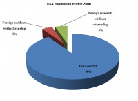
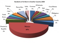
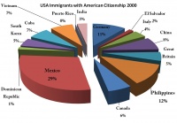
| + | The following 3 graphs were used to recreate USA population profile (graps 1-3). From the first graph, it is visible that 10% of USA population are people born outside of US, 5 % of which obtained USA citizenship.The second shows where most of the immigrants come from, and the third - how many of those immigrants obtained USA citizenship. | ||
| + | [[File:pop_prof1.jpg|200px|thumb|left|graph 1]] | ||
| + | [[File:Picture2.jpg|200px|thumb|left|graph 2]] | ||
| + | [[File:Picture3.jpg|200px|thumb|left|graph 3]] | ||
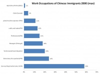
| + | Next, I decided to focus on specifically one nation (Chinese) and determine which work positions they tempt to work most of all in and in which countries (from the given OECD range). I particularly wanted to see if preferences for one occupation varied from other one, and wether some countries appeared more that once (graph 4). | ||
| + | [[File:Picture4.jpg|200px|thumb|left|graph 4]] | ||
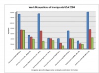
| + | I referred again at USA profile and established which professions get occupied the most by which immigrants (graph 5). | ||
| + | [[File:Picture5.jpg|200px|thumb|left|graph 5]] | ||
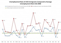
| + | Next, I looked at employment statuses for the total and female immigrants in USA, and compared the found unemployment rates with the average unemployment rate for the USA,2000 (graph 6) | ||
| + | [[File:Picture6.jpg|200px|thumb|left|graph 6]] | ||
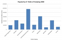
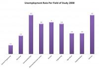
| + | My next step was to compare the popularity of fields of study and how many people with the particular field were currently unemployed (graph 7 - 8). | ||
| + | [[File:Picture10.jpg|200px|thumb|left|graph 7]] | ||
| + | [[File:Picture8.jpg|200px|thumb|left|graph 8]] | ||
| + | The last thing I compared was the number of males per particular occupation position vs population of women(graph9). | ||
| + | [[File:Picture11.jpg|200px|thumb|left|graph 9]] | ||
| + | ===== Results ===== | ||
| + | Sometimes I got predictable and expected results from my visualisations, such that the percentage of Mexican immigrants exceeds any other in the USA, or that people have problems with finding jobs with a degree in arts and humanities. However, I was able to get sometimes even surprising for me information. | ||
| + | When comparing unemployment rate of different immigrantes in USA, I was able to see a particular pattern - the highest unemployment rate was related only to Latin American Countries, while European and Asian countries obtained quite low unemployment rate. It didn't depend on the size of the foreign population from that region in the US, since in the chart the countries were lined up by the exceeding immigration to US population. This graph made me think that I just visualised the concept of discrimination in USA. No other countries from another regions of the world showed the same pattern, and the differences between the unemployment rate hugely varied, comparing to another range of countries. | ||
| + | It was surprising for me to see from graph9, than overall number of women are seen to be involved in technical jobs and it exceeds the percentage of men in that sphere enourmously. There are a lot of talks about the lack of women in science, and it was quite a discovery for me to see my results that brake the stereotypical opinion. Also, I was surprise to see that the number of men in agriculture exceeds the number of women, which I expected to be the opposite. | ||
| + | I never expected for Chinese to obtain such a small percentage of people who work in agriculture. Also, the fact that most of Chinese are involved in market,shop sales are in Hungary is very unpredictable. The chart also says, that the given results are the highest comparing to the rest of the countries. Does it mean that Hungary has better economical or social conditions for Chinese to have a high ration of involvement in that sphere, or, perhaps, this labour market doesn't have as much competition than anywhere else in the world? | ||
| + | From graph5 I was able to see that most percent of the immigrants in the US are involved in comouter/math science, managment and healthcare spheres. This graph can be used in everyday situations too. For example, if I am seeking to find a healthcare practitioner, I will know that I will receive most of the applications from Philippines citizens as foreigners. | ||
===== Tech Details ===== | ===== Tech Details ===== | ||
* Node: as5 | * Node: as5 | ||
Latest revision as of 04:40, 8 December 2011
- Title: Stereotypes Through Statistics
- Dataset used: A Profile of Immigrant Population in the 21st century in OECD Countries
- Aims and Ideas: Having a dataset about immigrants' population, I had a chance to create different population profiles, with the aim to verify and/or disprove certain stereotypical knowledge about the immigrants, as well as different nations. This includes me looking at occupations, countries of birth and labour force status.
- Complications: Unfortunatly, my data didn't include any unique identifiers, which made it hard to work with the dataset, as well as made it not possible to answer some of wanted queries. Also, data didn't have range of years, which limited me in the ways of exploring the data. When viewing my results, please, keep in mind that the data was collected for the year 2000, and is limited only for OECD countries.
Contents
Project Tasks
- Identifying and downloading the target data set
The dataset can be downloaded from here: http://www.oecd.org/document/51/0,3746,en_2649_33931_40644339_1_1_1_1,00.html
- Data cleaning and pre-processing:
Data is in CSV format. I had to illuminate few charcters. I erased ^M by using dos2unix file1 > file2 command
- Load the data into your Postgres instance:
Example of creating a table:
create table citizenship_age (country char(5),coub char(10),fborn int, edu_lfs int, edu_cen int, age_lfs int, age_cen int, nat int, number int, reg_oecd int, reg_regions char(30));
The used command for import is:
copy citizenship_age from '/path/to/the/file/FILE.csv DELIMITER ',' CSV;
- Develop queries to explore your ideas in the data
These are the examples of some of the queries I used to investigate different areas of my analysis Viewing total immigrants' population in USA, sorted by the country of birth:
SELECT coub, sum(number) from (select * from citizenship_age where country='USA' and fborn=1) as p1 group by coub;
Determening where in world Chinese immigrants work the most as managers (as an example). The returned result for each of the positions was further divided by the total Chinese immigrant's population of that country in order to get comparable ratio.
select country,occupation,sum(number) from occupations where fborn=1 and coub='CHN' and occupation>='10' and occupation<'20' group by country, occupation;
Determening immigrants of which country occupy work in business (as an example) more than others in USA.
select coub,sum(number) from occupations where country='USA' and occupation='USA_02' and fborn=1 group by occupation,coub;
Looking at unemployed female immigrant population in USA. Later the result for each of the nation was divided by the total employed femaile population of that nation in USA.
select country,coub,sum(number) from labour_status where fborn=1 and lfs_lfs=2 and and sex=2 and country='USA' group by country,coub;
Viewing how many people of the particular field of study are unemployed
select sum(number) from fields_study where field_edu=1 and lfs_lfs!=1;
Viewing overall population of females that work in agriculture (as example)
select max(sum) from (select coub,sum(number) from occuations where occupation>='60' and occupation<'70' and sex=2 group by coub) as p1;
- Develop and document the model function you are exploring in the data
- Develop a visualization to show the model/patterns in the data
The full presentation can be viewwed here: http://prezi.com/1vstya3qtmwy/big-data-project/ The following 3 graphs were used to recreate USA population profile (graps 1-3). From the first graph, it is visible that 10% of USA population are people born outside of US, 5 % of which obtained USA citizenship.The second shows where most of the immigrants come from, and the third - how many of those immigrants obtained USA citizenship.
Next, I decided to focus on specifically one nation (Chinese) and determine which work positions they tempt to work most of all in and in which countries (from the given OECD range). I particularly wanted to see if preferences for one occupation varied from other one, and wether some countries appeared more that once (graph 4).
I referred again at USA profile and established which professions get occupied the most by which immigrants (graph 5).
Next, I looked at employment statuses for the total and female immigrants in USA, and compared the found unemployment rates with the average unemployment rate for the USA,2000 (graph 6)
My next step was to compare the popularity of fields of study and how many people with the particular field were currently unemployed (graph 7 - 8).
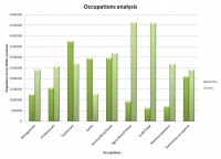
The last thing I compared was the number of males per particular occupation position vs population of women(graph9).
Results
Sometimes I got predictable and expected results from my visualisations, such that the percentage of Mexican immigrants exceeds any other in the USA, or that people have problems with finding jobs with a degree in arts and humanities. However, I was able to get sometimes even surprising for me information. When comparing unemployment rate of different immigrantes in USA, I was able to see a particular pattern - the highest unemployment rate was related only to Latin American Countries, while European and Asian countries obtained quite low unemployment rate. It didn't depend on the size of the foreign population from that region in the US, since in the chart the countries were lined up by the exceeding immigration to US population. This graph made me think that I just visualised the concept of discrimination in USA. No other countries from another regions of the world showed the same pattern, and the differences between the unemployment rate hugely varied, comparing to another range of countries. It was surprising for me to see from graph9, than overall number of women are seen to be involved in technical jobs and it exceeds the percentage of men in that sphere enourmously. There are a lot of talks about the lack of women in science, and it was quite a discovery for me to see my results that brake the stereotypical opinion. Also, I was surprise to see that the number of men in agriculture exceeds the number of women, which I expected to be the opposite. I never expected for Chinese to obtain such a small percentage of people who work in agriculture. Also, the fact that most of Chinese are involved in market,shop sales are in Hungary is very unpredictable. The chart also says, that the given results are the highest comparing to the rest of the countries. Does it mean that Hungary has better economical or social conditions for Chinese to have a high ration of involvement in that sphere, or, perhaps, this labour market doesn't have as much competition than anywhere else in the world? From graph5 I was able to see that most percent of the immigrants in the US are involved in comouter/math science, managment and healthcare spheres. This graph can be used in everyday situations too. For example, if I am seeking to find a healthcare practitioner, I will know that I will receive most of the applications from Philippines citizens as foreigners.
Tech Details
- Node: as5
- Path to storage space: /scratch/big-data/elena
Results
- The visualization(s)
- The story
